How To Build Custom Menus With Divi 5’s Link & Dropdown Modules
Creating a custom menu is a crucial aspect of web design, especially for business owners looking to enhance user experience on their websites. Divi 5 introduces new functionalities that take menu customization to the next level, particularly with its Link and Dropdown modules. This allows you to craft menus that are not only visually appealing but also functional, regardless of whether your site is built on WordPress or WooCommerce.
Understanding the Limitations of Classic Menu Modules
The classic Menu module in Divi has served many business owners well. However, it can feel quite restrictive for those wanting a more tailored approach to their navigation. Limits in structure, design, or dropdown menus may hinder your ability to provide an optimal browsing experience. Thankfully, Divi 5 has expanded its capabilities, offering more flexibility through its Link and Dropdown modules.
These new features empower you with control over the menu design, enabling you to align it with your brand’s identity seamlessly. This is particularly important when operating in competitive markets in Australia and Europe, where every detail can influence customer engagement and conversion rates.
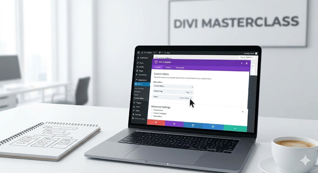
Creating Your Custom Menus: Step-by-Step
Building custom menus with Divi 5 is now more straightforward than ever. Here’s how you can leverage the new Link and Dropdown modules to create a menu that stands out:
- Access the Divi Builder: Start by navigating to the page where you want to place your menu. Activate the Divi Builder for easy integration of the new modules.
- Add Modules: Select the Link or Dropdown module from the options. The Link module allows you to create standalone links, while the Dropdown module is perfect for nested links.
- Customize Styling: Utilize the design settings to adjust colors, fonts, and padding to align with your brand guidelines. A well-styled menu enhances user interaction.
- Setup Dropdown Behavior: Configure how the dropdown will behave on hover or click. The choice can significantly affect the usability on mobile versus desktop interfaces.
- Preview and Test: Always preview your changes to see how users will experience the menu. Testing can uncover potential usability issues before your site goes live.
These steps will guide you in crafting a menu that not only meets practical functionality but also enhances the overall aesthetics of your site. As you customize, remember that simplicity often leads to better user experience.
Enhancing Mobile Navigation
In today’s digital world, an increasing number of users are accessing websites via mobile devices. As such, your custom menus must also function seamlessly on smaller screens. Divi 5 allows for adjustments specifically for mobile navigation, ensuring that your menu is just as easy to use on a smartphone as it is on a desktop.
Use the responsive editing features to hide or rearrange menu elements for mobile users. For instance, consider utilizing a mobile menu that collapses into a hamburger icon, providing a cleaner look while retaining functionality. This not only enhances user experience but can improve your site’s overall performance metrics, leading to increased customer satisfaction and engagement.
With these enhancements in place, your custom menus will be well-equipped to serve your visitors effectively, directing them to the right areas of your site and ultimately boosting conversions.
Need help? Book a free strategy call at mbohra.com